Let’s journey back to a time when professional webpages were just text, basic hyperlinks, maybe an image or two, and perhaps a form. And if you were lucky, a homepage might play a catchy digital tune for you!
Forget the 1990s—this was the standard recipe for creating webpages even earlier this decade (minus the automatic audio, thank goodness). Web designs vastly improved, images worked better, and menus became more user-friendly, but essentially the goal was to provide information within static pages.
Users’ expectations of webpages have evolved over the years; they assume—even demand—an interactive experience every time they come to your website. Web design has kept up by taking the visual storytelling experience to the next level. Animations are now a big part of this design philosophy. Thanks to the advanced ways of CSS3, HTML5, SVG elements, and lightweight JavaScript, today’s animations are smoother, more sophisticated, and more mobile-friendly than ever.
Why Use Animations?
Of all the interactive elements you might design into a webpage, animations particularly stand out. The benefits of animations include:
- Animations tell you how to do things, draw attention to a webpage element, and guide visitors through a process—showing them the next step they will/should take on their journey through the website.
- Animations serve a purpose for visitors or at least aesthetically tell a story. This keeps visitors engaged for longer.
- With the rise of simplistic, flat, modern design, many visual cues have been removed from webpages. Adding animations without changing the aesthetic helps guide visitors through the website experience.
When considering animations, ask yourself: Will they add to the user experience or take away from it? Will they influence a user’s behavior and help conversions and CTA clicks? Knowing your personas is important so that animations truly help achieve your company’s business goals.
Four Types of Animations
Website animations can range from simple hover states to large animations that are almost like video. Simple animations often work best, because too many can be frustrating for visitors. These subtle interactions are tasteful, attract the user’s attention to important webpage elements, and ultimately enhance design.
Larger animations, when used sparingly and on the right project, can provide a powerful impact by offering motion graphics and an incredibly interactive experience for the user. Be sure these larger elements are smooth, not jumpy.
Types of animations include feedback indicators (such as hover effects, notifications, progression loads, and form validation), visual storytelling elements (such as parallax scrolling, typography animations, content fading, screen transitions, and walk-throughs), and navigation elements (such as hidden navigation menus and scrolling galleries). What follows are four popular types of animations and examples that can provide some zing to your website experience:
1. Hover effects and tool tips
Good website interaction must provide feedback to the user. Simple CSS animations, such as those found on animate.css, deliver subtle feedback on any type of hover action, including image or button hovers. Hover actions and tool tips also provide a valuable user experience—they can help with navigation or offer additional information. Note: These animations won’t work on mobile or touchscreen devices, so valuable information must be showcased in other ways.

In this example, something as simple as a 3D hover effect lets visitors know they have clicked on the button.

In this informative codepen notification example, the hover not only changes styles but also provides the visitor with some type of information (in this case, file size).
2. SVG animations
Scalable vector graphics, or SVGs, are dynamic vector elements that are scalable, artwork-based, responsive, and smaller in size compared to images and rasterized graphics. In many instances, JavaScript isn’t necessary to produce animated SVGs—just CSS3. SVGs allow you to animate and scale anything, from a simple vector icon to an advanced illustration. These two examples animate smoothly and render perfectly on any browser size:

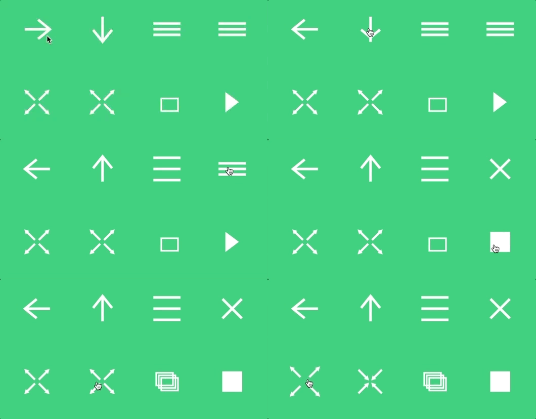
Taken from a Codrops article, the icons change subtly when clicked. This can be used on a variety of navigation elements to inform the user that an action has been taken.

From another Codrops article, this example demonstrates a dynamically loading computer image—a good alternative to a static image.
3. Parallax
Parallax animations are better for visual storytelling and engaging the user. They create depth, add layers to the design, and provide a more dynamic and interactive web experience.

In this example from Echo, new information is presented along with additional screenshots as the user scrolls down the page. Instead of a static website, a cohesive story is told that takes the user experience to the next level.

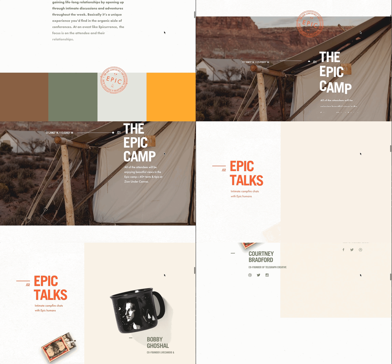
Epicurrence uses typography, large background images, and random elements to add movement and life to the page. This is another great example of dynamic storytelling.

Page and navigation transitions provide subtle effects by revealing a new page rather than typical static page loading. Startuplab.no does a great job of loading a new webpage by expanding and collapsing elements. Unlike typical pages that clear the screen to reload, movements on the webpage transition into the next for a smoother experience.
4. Interactive forms
You want website visitors to fill out forms and further engage with your brand. Interactive forms increase the odds that users will want to start and continue the relationship.

Platform does a great job of turning a form into an interactive questionnaire. This page calculates (in the top right) and also shows where you are within the list of questions (via a bottom loader). At the end of the form, after submitting, it gives visitors a preview of a summary but blurs out the results as a way of gating the form. Users must then provide basic information to read the rest of the results.

Another Codrops animation example is this natural language form with custom input elements. This form is more engaging and interactive by using natural language to obtain information from the user. A question is constructed in which some words are dropdown elements and/or text inputs. This can be used for headlines with CTAs.
Designer, Beware!
Animations are great for engaging, interactive website design, but you should proceed with caution, particularly if you are using JavaScript. Too many JavaScript animations can slow load times, and some limitations still remain on what search crawlers can consume. Moreover, heat-mapping solutions are not able to collect data from JavaScript-animated pages.
The solution to this dilemma is to use lightweight JavaScript or CSS to prevent lengthy loading times. CSS is preferable because it doesn’t affect load times, but lightweight JavaScript is a good fallback. When animations are speedy and fluid, the user experience benefits, as does, ultimately, your brand.
What websites have you come across that impressively use animations?
Source: B2C

No comments:
Post a Comment